20 (26)
<img src="nokia3.wbmp" alt="nokia3"/>
</p>
</card>
<card id="card2" title="Nokia page">
<p>
…
</p>
</card>
</wml>
5.3 DO element and dynamic buttons
5.3.1 WML DO Construct: Dynamic Buttons
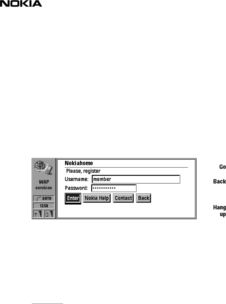
WML makes it possible to include ‘dynamic buttons’ in the card. The do element binds a task to a user
action. The buttons are displayed in a neat fashion (flushed left with a little space between the
buttons). Figure below illustrates the dynamic buttons with input fields.
If the dynamic buttons are specified in card wide scope (inside a card), they are rendered inline within
the text. Deck wide do-elements are always placed at the end of the card.
Please note that if there is no label attribute defined for a do-element, the button will be named 'go'.
Therefore, pay a special attention to always include a label attribute in a do-element.
In addition, there is a special menu item called 'Actions', which is a list of current dynamic do controls.
The item names in Actions menu are the same as the button labels. If there is no label, the menu item
will be named 'go'. Therefore do-elements should always have a label attribute defined. Furthermore, if
no action buttons have been defined, Action menu is empty (dimmed). Actions can be shadowed by a
noop event in which case they are not shown in the list at all. All optional do elements are rendered.
DO-attributes:
label specifies a textual string suitable for labelling of a button.
name specifies the name of the do event binding.
Optional Boolean. If this attribute has a value of true, the user agent may ignore this element
type provides a hint to the user agent about the authors intended use of the element and how
the element should be mapped to a physical user interface construct.
Example 7. DO-element - buttons
<wml>
<template>


